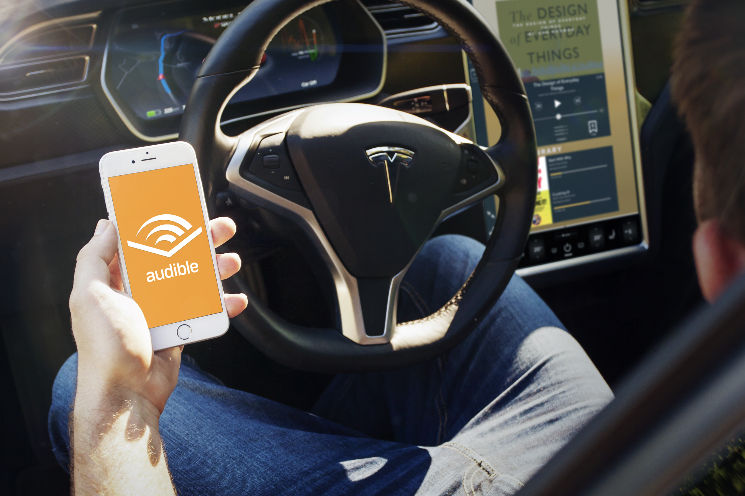
“Your favorite audiobooks now in your Tesla”
MY RESPONSIBILITIES
Product Designer
KEY OUTCOMES
Final comps for all 6 widget sizes
Prototype for testing
TIMELINE + TEAM
Sole Designer
2 Weeks
Overview:
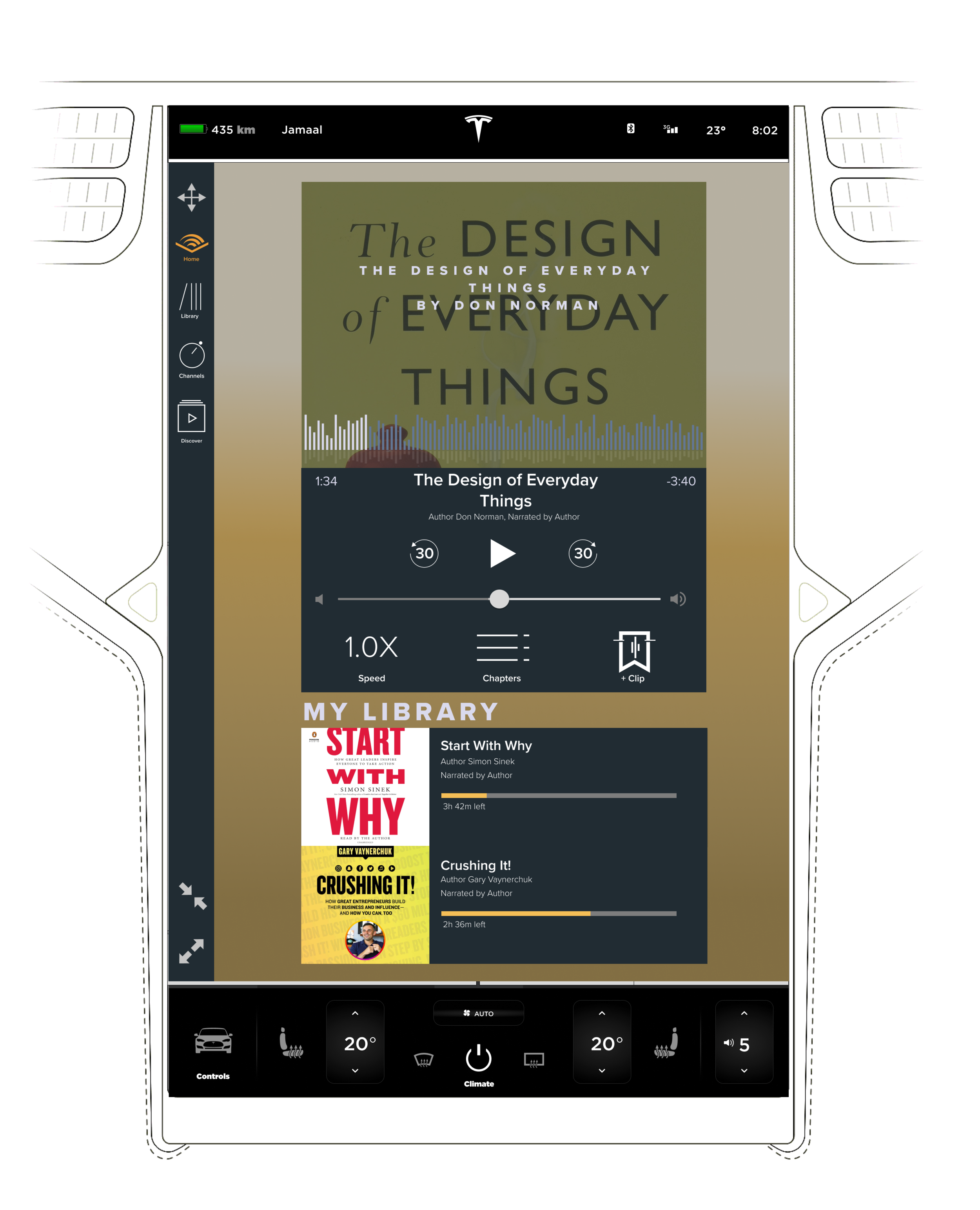
Audible is the world’s largest seller and producer of audio books and other spoken-word entertainment, enriching the lives of millions of listeners daily. The goal of this project was to design the core interface of the Audible app specifically for the Tesla dashboard interface.
Challenge:
Tesla users are seeking a unique experience in their vehicle that has some familiarity from using Audible on other devices. My goals were too: design with usability and accessibility requirements in mind, make interactions more intuitive and efficient while driving.
“How might we continue to reach all of our listeners who are on the go and listening in their vehicles?”

Users Audience:
Audible users that also own a Tesla or a smart car with a digital interface.

Processes + What I Did:
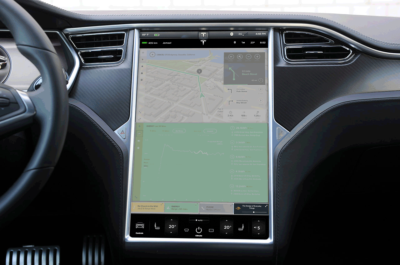
Started off researching other interfaces from Audible and how they curated other interfaces like CarPlay. After getting a sense of their design patterns. I started to sketch various directions for the layout using the Tesla dashboard widget constraints as the guide.
Got early feedback on the flow and necessary functions from paper wireframes, testing with 4 current Tesla users.
Created final comps that catered to each of the 6 various dashboard widgets that are responsive within the interface depending on where they are positioned.
Ideation Sketches
Now I had enough info to start ideating possible solutions.

Paper + Digital Wireframes
After some feedback I was able to whittle down my options to a paper prototype which went straight into some user testing via paper wireframes. Once we felt on the right track, jumped right into some mid-fi wireframes. After another green light from the team, I jumped into the visual design to get a first glance at some high fidelity screens.


Outcomes + Learnings
Users should be focusing on driving, not on a flashy interface; so make everything simple, efficient and legible.
If we are going to be designing interfaces for autonomous vehicles in the future, it is vital to focus on accessibility for all drivers/passengers.
I really enjoyed working on a non-mobile/web interface. Designing for larger/different shaped screens is a great challenge!